


Components
- KonstaProvider
- App
- Action Sheet
- Badge
- Block
- Breadcrumbs
- Button
- Card
- Checkbox
- Chip
- Contacts List
- Data Table
- Dialog
- Floating Action Button
- Icon
- Link
- List
- List Button
- List Input
- List Item
- Menu List
- Messagebar
- Messages
- Navbar
- Notification
- Page
- Panel / Side Panels
- Popover
- Popup
- Preloader
- Progressbar
- Radio
- Range Slider
- Searchbar
- Segmented Control
- Sheet Modal
- Stepper
- Tabbar
- Toast
- Toggle
- Toolbar
- Toolbar Pane
Konsta UI & SvelteKit
Let's see how to use Konsta UI Svelte components with SvelteKit.
Contents
Create SvelteKit Project
First, create a SvelteKit project
Install Tailwind CSS
We can follow official Tailwind CSS for SvelteKit installation Guide
Install Konsta UI
Now in created SvelteKit project, we need to install Konsta UI:
npm i konsta
And in your app.css file we should import Konsta UI's theme file:
@import 'tailwindcss';
@import 'konsta/svelte/theme.css';
App Component
Now we need to setup main App component so we can set some global parameters (like theme).
We need to wrap whole app with App in the ./src/routes/_layout.svelte:
<script>
  import '../app.css';
  import { App } from 'konsta/svelte';
</script>

<App theme="ios">
  <slot />
</App>
Example Page
Now when everything is set up, we can use Konsta UI Svelte components in our SvelteKit pages.
For example, let's open src/routes/index.svelte and change it to the following:
<script>
import {
Page,
Navbar,
Block,
Button,
List,
ListItem,
BlockTitle,
} from 'konsta/svelte';
</script>
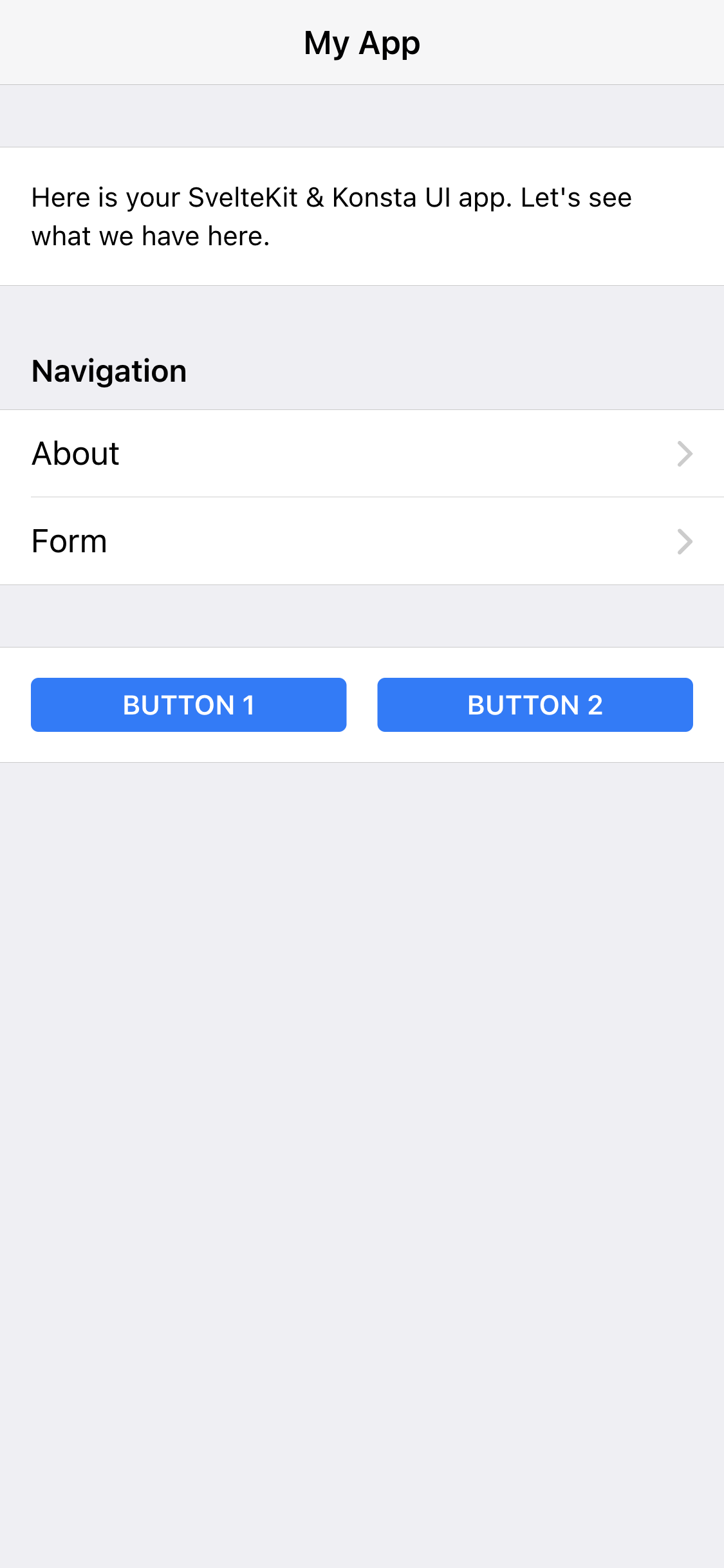
<Page>
<Navbar title="My App" />
<Block strong>
<p>Here is your SvelteKit & Konsta UI app. Let's see what we have here.</p>
</Block>
<BlockTitle>Navigation</BlockTitle>
<List>
<ListItem href="/about/" title="About" />
<ListItem href="/form/" title="Form" />
</List>
<Block strong class="flex space-x-4">
<button>Button 1</button>
<button>Button 2</button>
</Block>
</Page>
As a result we should see the following page:


